Ssense
First iteration of the Order Management System.
Client
SSENSE is a multi-brand retailer based in Montreal, Canada specialising in the sale of designer fashion and high end streetwear. It was founded as an e-commerce platform in 2003 by three brothers: Rami, Bassel and Firas Atallah.Ssense is an operator of a fashion retail agency intended to push the limits of traditional e-commerce. The company's agency operates an online platform as well as retail outlets to sell products from a selection of independent, luxury, and streetwear designers and also produces its own original editorial content, enabling people to get a host of different luxury brands in one place.
Problem
The current HQM system is a legacy application that cannot handle new features. Any big changes will break the application. The current HQM application also has a lot of usability and technical issues. And no one has ever surveyed the application nor interviewed the users to find the pain points. Ssnese is opening a second fulfillment center in Europe. The current HQM cannot and does not show anything related to the new fulfillment center.
My Role
I was hired at SSENSE as a Senior UX Designer to design the new Order Management System to be used throughout SSENSE to process all orders in-store and online. I was solely responsible for the redesign of the new OMS. I had full freedom to set my own deadlines, define my own process and collaborate with anyone at SSENSE inorder to deliver results.
I worked with the Sr. Researcher, Benoit Meunier, to design workshops that gave the stakeholders to untangle the problems with the current legacy system together by going through a series of collaborative group exercises that I designed to get to a specific outcome. These workshops helped align everyone onto the same page, and helped make decisions for the design process of the new OMS.
I collaborated with the product manager: Yakun Wang, in order to schedule 34 user interviews with actual users of the old OMS, aka, HQM, which included: personal stylists, customer support agents, logistics, fraud analysts, warehouse managers, store retail agents, returns agents. I also interviewed team leads & managers of above said users who also use the old system but in a slightly different manner.
I worked with the Senior Product Director: Sara Lithwick, to contact other off-the-shelf CRM solutions to do a competitive analysis, a cost analysis, feature fit, and finally the buy-in from the rest of the company to use just one CRM instead of 20 internally built custom applications that do not have any consistency or sync between them. I worked on the competitive analysis and the feature fit. We worked together on the cost analysis. And she is working on the buy-in front th rest of the company for the big switch.
Cross Functional Stakeholders
That I worked with, in this Project
- Senior Product Director : Sara Lithwick
- Product Manager : Yakun Wang
- Program Manager : Bachir Bennani
- Senior UX Researcher : Benoir Meunier
- Associate Manager, Customer Experience : Renata Valle
- Senior Associate Manager Operations -Transfers and Shipping : Melissa Mejias
- Associate Manager, Fraud Prevention & Fulfillment : Tiffany Simmons
- Associate Manager, Logistics : Lara Tunc
- Sr Manager, Personal Shopping : Quincy Korte-King
- Associate Manager | Operations | Returns : Richard Crispino
- Associate Fraud Prevention Analyst : Alessandra Hidalgo
- Personal Stylist : Ahmad Darwich
Video/screen-share UX interviews
Questions
These are broadly the types of questions I asked during the 34 user interviews. As they answer my question, I would ask a lot of clarifying questions to unwrap step by step of what is actually happening. So that I can find hidden pain points and inefficiencies.
- What is your role and responsibilities at Ssense?
- What are the tasks that trigger you to open HQM?
- Please screenshare and show me an example of a task end to end where it involves using HQM.
- What are all the different platforms/ applications you use on a daily basis?
- What are some issues you run into while using HQM?
- What is the frequency of each type of task performed in HQM by all the users? (Stats. I would only ask a team lead this question)
- What are things that you like about your job in general?
- What are things that are frustrating about your daily responsibilities in general, doesn’t have to be something inside HQM.
Participants
This is the list of participants tracked on an Excel sheet
Key insights from the Interviews
- 100% of the users had syncing issues between HQM and other applications
- 100% of the users find that the search page is too slow (1-2 minutes to load)
- 90% of users have faced problems with the addresses like typos, wrong formats, no postal codes
- 90% of time users had to use hacks like what’s listed below in order to apply discounts or price match
with their own website or price match with their competitors
- changing the price of an item manually or
- adding random items to just create an order with the correct discounted total price
- 100% of the time PPA button doesn’t work if the order is being shipped to china
- 100% of the time CX agent is not able to change the shipping method from Canada Post to DHL upon customer’s request and order eligibility, they have to create a ticket and contact warehouse to do this manually
- 80% of the users modify the HQM url instead of search for an order using the search features
- 50% of the users are not able to understand the logs / comments. “Barely intuitive”
- 100% of the time security team and fraud analysts have to have to copy paste each field into excel for chargebacks & dispute.
- 100% of the time personal stylists have to manually double check every single order placed by their clients.
- 10% of the time HQM doesn’t sync with the warehouse. For example if wreshouse already shipping the return, it might still show as order pending.
- 100% of the time when making changes to the shipping or billing address (change province/state), HQM will not recognize that any modification was done, forcing us to add or remove characters to the other fields in order to be able to confirm the changes.
- 100% of users are unable to trace if the return label was successfully sent and whom it was ever sent to
- 10% of the users are not able to give the discount because refund system expires after 6 months- unable to give discounts. so have to do it manually
- 100% of the users are unable to edit /delete the HQM comment once it is written
- 10% of the users read the comments to figure out which category is the issue and send it to the right team manually
- 100% of the security team is unable to block the user in HQM if they find evidence of bad patterns
- 100% of the users manually write a sku# to look up a product
- 100% of the personal stylists Don't know if payment will fail in the very last step of creating an order for their client. All these 6 pages of filling out information to create an order, gets wasted.
- 50% of the time users end up cancelling the entire order because they don’t have ability to make the certain changes like apply discounts, change address, change payment method, etc,
- 30% of the time users don’t have correct access to perform their task, and so have to pass it one to another team member which will take days, sometimes weeks
- 100% of the users use 6 to 15 different applications at the same time to do their daily tasks.
- 100% of the users find it very difficult to onboard and learn 10 - 15 different applications at the same time
- 100% of the users manually read through any order they open for any reason to check for red flags, before they perform their task.
- 80% of CX agents tickets are due to wrong addresses
- 100% of the time when the carrier changes, the tracking number is not updated
- 100% of the users find the connection link to HQ from HQM is very slow, and searching anything in HQ is very slow, so they try to avoid it as much as possible.
Understanding the Functionality of the current HQM App
As I did the interviews, I also mapped out the current application, and wrote down the functionality of each part of the HQM application on Lucid Chart.
3-Day Workshop
I worked with the Sr. Researcher, Benoit Meunier, to design workshops that gave the stakeholders to untangle the problems with the current legacy system together by going through a series of collaborative group exercises that I designed to get to a specific outcome. These workshops helped align everyone onto the same page, and helped make decisions for the design process of the new OMS.
Workshop Structure
Workshop Prompts
Where is the biggest problem in HQM?
What is the most impactful aspect of OMS we should focus on?
I will take you through 3 activities that will help us understand the user's point of view so we can prioritize what's next
Feedback Grid
I started off with this simple UX Research tool called the Feedback grid as an icebreaker to get started. I started with the “what’s working well” quadrant. After participants input different perspectives on to the sticky notes, I used the voting feature on Mural, to give each user(only), not product managers, 4 votes each to vote on what they agree with the most. Then I read off the voting results, as we saw the voting results, this initiated debates on why some users think differently, and they would explain their choices and decisions. This in turn bridged the gap between different teams and also between users & stakeholders.
I repeated this for the “Needs to change” section. This section was intense. There was a lot more input from users and also a lot more debates on what is most broken, what needs to change immediately. Turns out every user team, and even managers had a different opinion on what’s most important in this section. This exercise really helped surface those differences in opinions. And helped everyone come on to the same page at the end of the workshop on what we need to focus on. I also repeated this for the “New ideas” section.
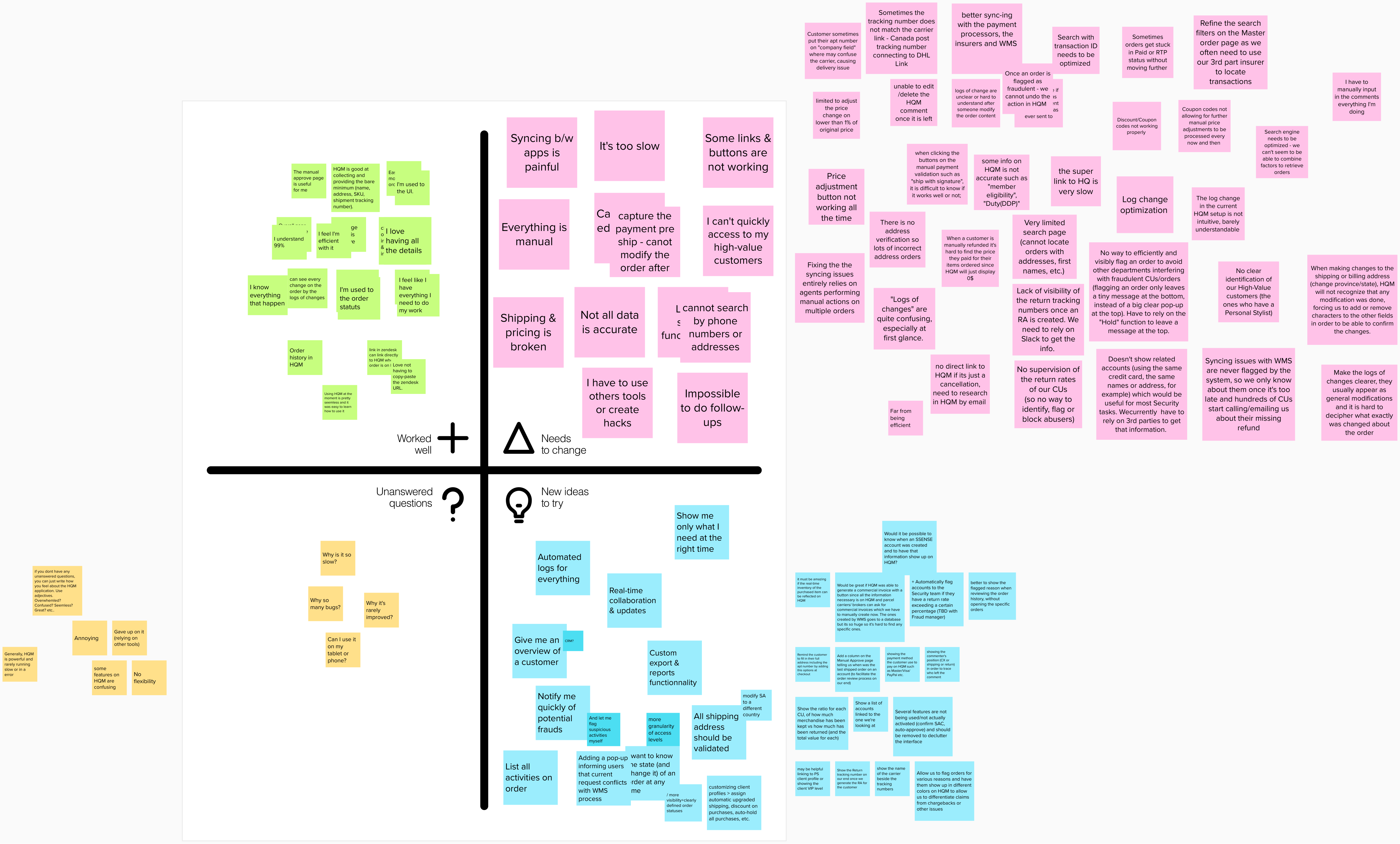
The feedback grid is a tool designed to help you structure the information gathered from user testing
Voting Results & Insights
Different users care about different things.
The voting results are very interesting. As you can see, many of the votes are distributed flatly, this means different users care about different things, which further supports my proposal to design the new OMS based on user profiles.
Syncing between apps is poor because we have no concept of user profiles and permissions.
In the “needs to change” section, the highest votes were given to issues with ‘syncing between applications’ → the root cause of this problem is that for any simple task, like processing a return, or applying a discount, or checking where the package is, or check user order history, etc, one would have to open multiple applications just to perform any single task. If we know what are all the different user profile types and what tasks do each of those user types perform and what permissions they need for each of those tasks, it would be could isolate different user types to different apps. And they wouldn’t have to jump around all these apps just to accomplish one task.
Current system is too slow, with too many bugs, and doesn’t have features needed to avoid repetitive tasks.
The reason for this as we already know, it is a legacy system, and it cannot be modified. One solution to solve this problem is to rebuild from scratch. But when we do, we need to remember that there are features that don’t exist in the old system that are essential in the new system.
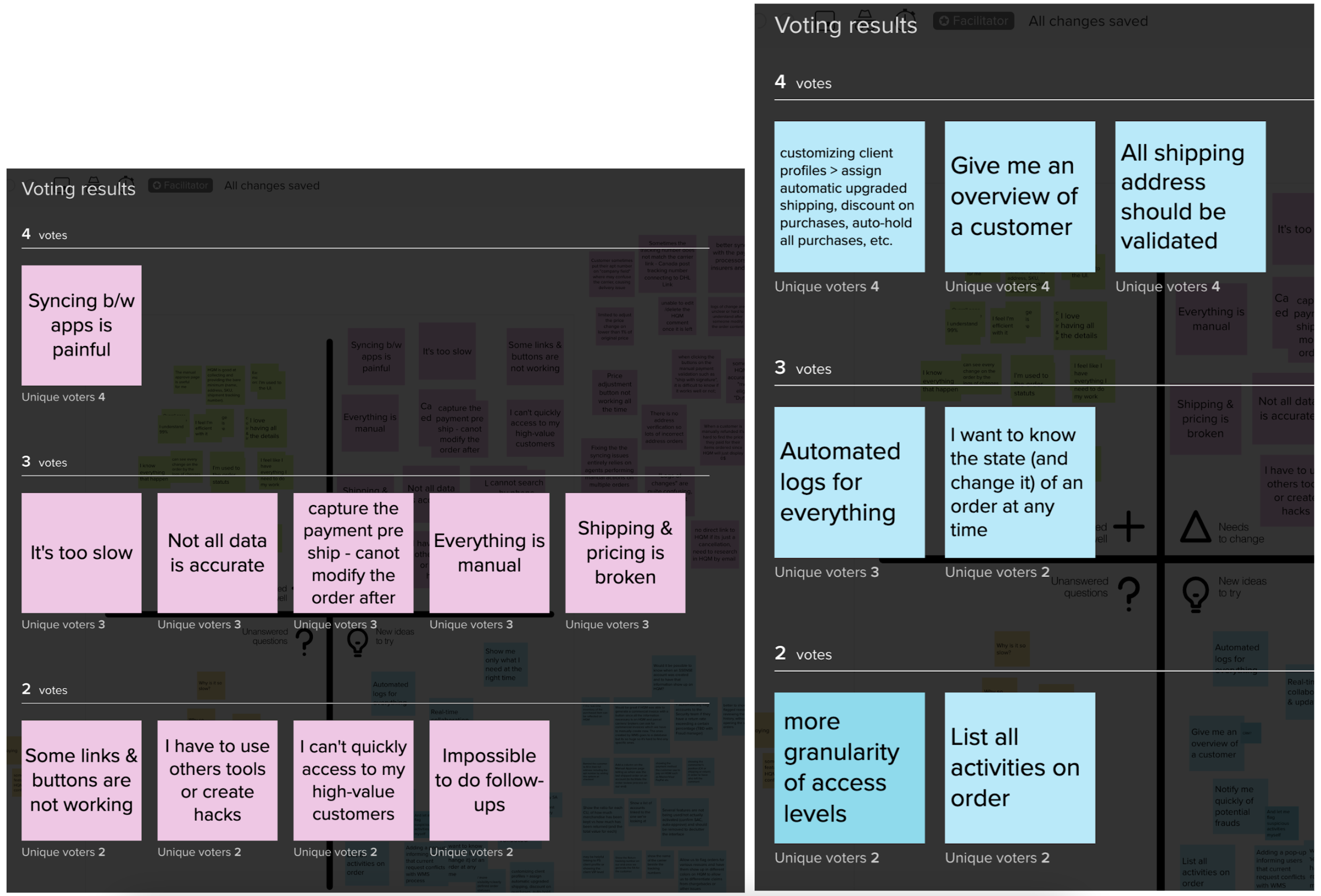
These are the Voting results from the workshop done in Mural Application.
Affinity Mapping
Affinity Mapping is a practice used to organize ideas or insights. It allows large numbers of ideas stemming from brainstorming to be sorted into groups, based on their natural relationships, for review and analysis. After the feedback grid exercise, I grouped together all the feedback that I've gotten from the interviews into regional groups. Some of these sections fall outside of scope like ‘WMS’ & ‘HQ’. I send feedback like these to their appropriate product teams, so that they can take action. When I am brainstorming wireframes or solutions for a certain section, I can look back here to see all the feedback for that section and see if the new ideas solve them.
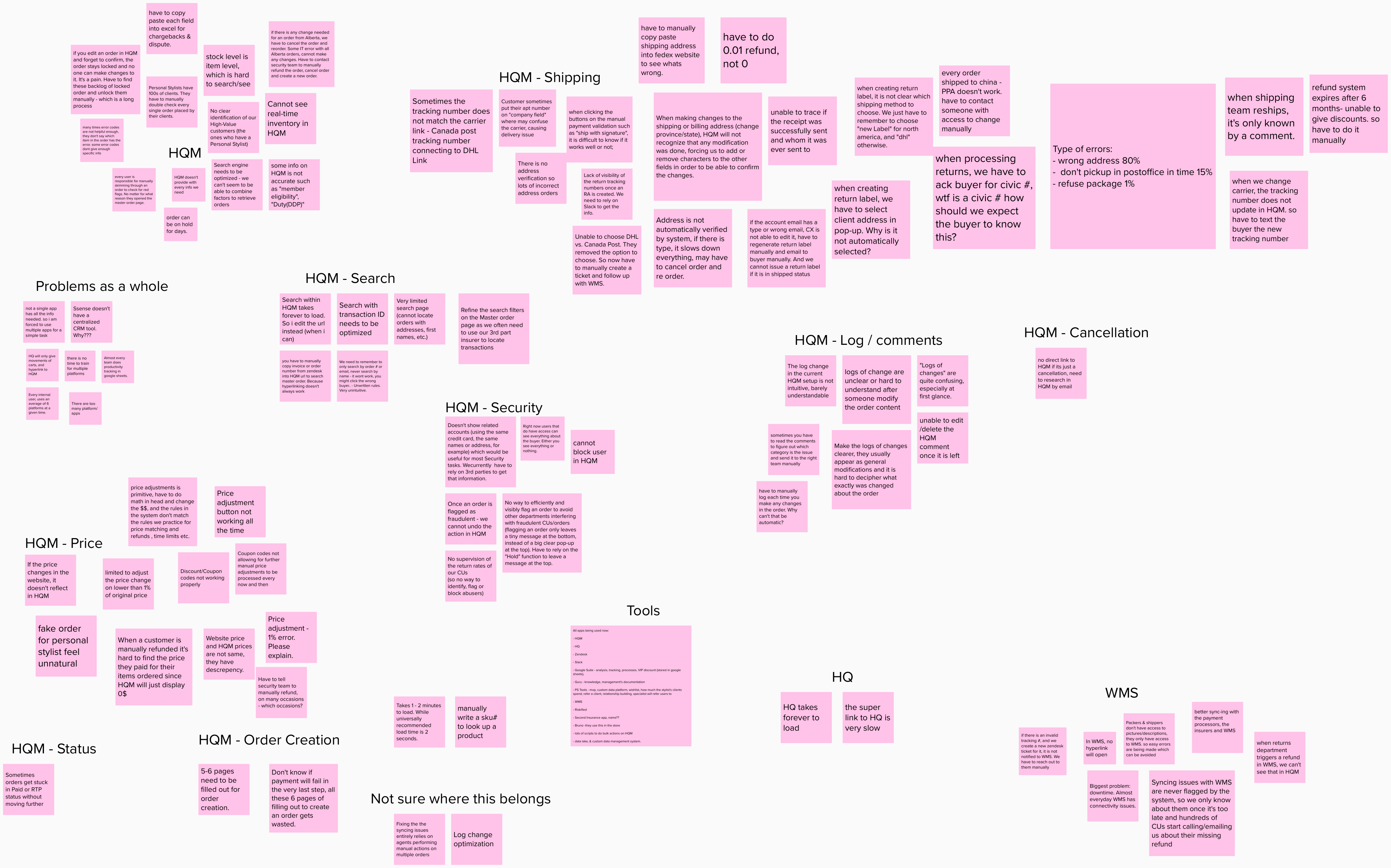
Affinity Mapping is used for Collaboratively Sorting UX Findings and Design Ideas. This method is used to organize research findings or to sort design ideas in ideation workshops.
Personas
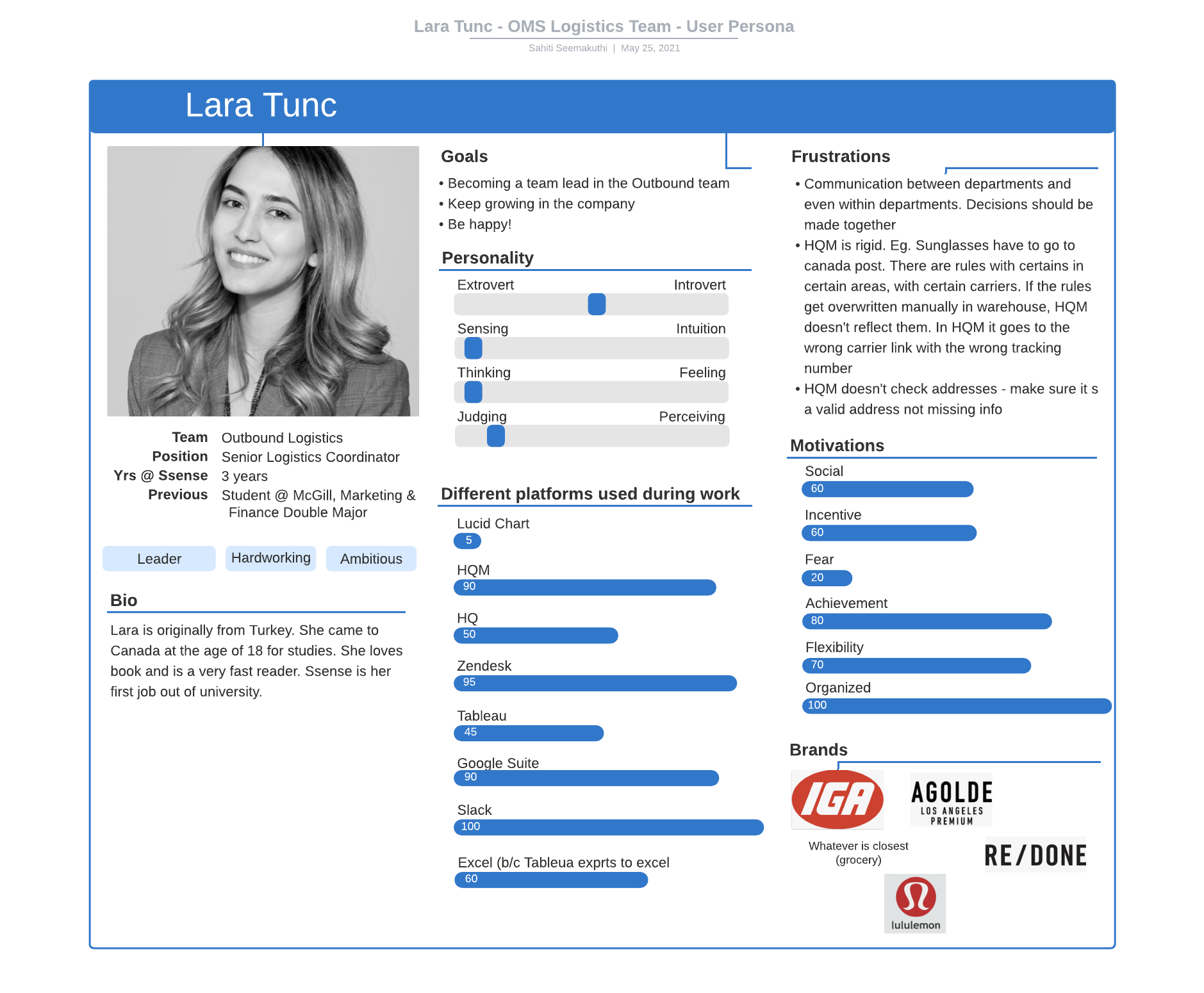
Although we had eight different user teams, I picked three different persona types that would accompass every type of user. First we have Lara Tunc, who represents the team lead. This type of user doesn’t necessarily do day-to-day tasks like processing returns etc, but she would care more about KPIs, productivity of her team of customer success agents, etc. A overall view of what are is happening in her team.
Secondly, we have Alessandra Maria, a fraud analyst. She has been in Ssense for several years and is now a power user of all the apps at Ssense. Users like these need more powerful tools like bulk-actions, be able to see a lot of info about users, order, patterns summarized in a neat manner in one location. Power users like Alessandra may find a lot of the old system straightforward because they are so used to the system. They like having control and knowing where everything is and how everything works. So these types of users are more likely to be opposed to change.
Thirdly, we have Ahmad Darwich, is a novice user of HQM that only utilizes 30% of the application’s features. Ahmad is a personal stylist who caters to his VIP customers by attending to their every request. This would mean for instance, creating orders, applying VIP discounts, changing shipping carrier to ship faster etc. He uses another application, PSTOOLS to get notified every time any of his clients purchases anything. He will open their order and makes sure the address is correct, and appropriate tier discount is applied and the correct shipping carrier is selected.
Senario Mapping Workshop
Describe the Senario Mapping workshop here...
The goal of the scenario is to provide a realistic, in- context view of a specific use of the system, from the user's perspective. Scenarios help to understand and illustrate how people experience products and services at a deeper, more contextual level, and how their needs and expectations change over time.
Defining our design principles
- AUTOMATION - the OMS needs to be efficient, clear & intuitive for every single type of user. They need to be able to solve problems quickly and serve their customers better by not getting bogged down by manual & tedious actions.
- MINIMAL - Less is more, don’t clutter with things that doesn’t matter to any particular user. We need to know what type of users perform what type of tasks, and what sets of permissions / access does each of those types of tasks require. So that we can design a personalized experience for every type of user. This also reduces security risks because we don’t need to show all the information in HQM to every user.
- INTUITIVE - When you open an order, you need a clear snapshot of exactly what the problem is, history of the order, history of the user’s orders & behaviors, all related addresses & email addresses. In order to eliminate simple errors, fraud, and handing off to another team and wait days. When you look at the status bar on an order, anyone should be able to understand exactly what is possible to change and not change for that order.
- ABILITY TO TRACE ANYTHING - We need well structured systems that log everything that happens to an order and everything in-between. So that we can easily track productivity, performance of KPIs for all different user teams, catch repetitive errors, reduce losses on giving free discounts for simple issues that could have been taken care of.
- ABILITY TO SEE YOUR TO DOs - When a user logs in to HQM, they need to be able to know what their tasks are, what they should work on next, and also see their priority. Be able to get notifications of changes in their assigned tickets.
AS-IS Journey Mapping
Mapping out an entire CRM of a company is a huge task. The purpose of creating the journey map of the exsisting Order Management System at Ssense is to capture all edge cases and find user painpoints at a very in-depth level. There are two types of joueny maps, the "AS-IS" journey map that maps out exactly what is happening now, and how. The second is the "FUTURE" journey map, which accounts for the ideal mapping of your system. In this situation, the best thing to do is the "AS-IS" journey map to capture all the use cases and map out how 8 different teams all use this one software to accomplish tasks.
I took each use case and mapped them out with screenshots. Then, I added start-triggers for each user case in light blue, added opportunities to improve, or ideas to solve problems in yellow, painpoints in pink, touch points in purple. This will really help in the next section: brainstorming wireframes for the new solution.
In this journey map, you will see:
Green for 'User Action', which explains what is happening in the flow.
Blue for 'Start Triggers', which explains what causes this perticular use-case to start.
Pink for 'Pain Point'. Definition:
"Painpoints are specific
problems faced by current or prospective customers in the marketplace. Pain points include any problems the
customer may experience along their journey Pain points are real or perceived irritants–often a critical
factor in gaining or losing customer loyalty and trust. This means you want to prioritize and solve these
problems fast."
In this journey map, I highlighted painpoints by observing user's words, thinking, and actions while they
are performing these tasks.
Yellow for 'Opportunity'. Opportunities are new ideas, ideas for solutions, ideas to change something in the software or the business logic or the user flow to make the jounrey more simpler, more efficient. Some of these opportunites are from users while they are performing the perticular task. Some are from me, while i observe users, some are from other users who looked at this journey map and provided insight.
Purple for 'Touchpoint'. Definition:
"During a customer journey, a user may interact with an organization several times using several different
channels. Each of these interaction instances represents a touchpoint between the customer and the
organization. A touchpoint represents a specific interaction between a customer and an organization. It
includes the device being used, the channel used for the interaction, and the specific task being completed.
A customer journey is made up by a series of touchpoints, with each touchpoint defining the details of the
specific interaction."
Touchpoint is the most important this in a journey map in my perspective. 90% of the user experience breaks
when a user a either switching from applications or switching from devices. If we can identify these and
solve for them, we would have solved 90% of the UX problems with a product.
In this 'AS-IS' journey map below each vertical flow represents a different use cases of how this
software is being used.
Journey mapping is a shared vision of a critical goal, because, without it, agreement on how to improve customer experience would never take place. Second, the shared artifact resulting from the mapping can be used to communicate an understanding of your users to all the stakeholders.
Whiteboarding
What info does CX care about in this page?
- product details
- Order Status
- Buyer info, history purchases, patterns, all addresses, all emails used in the past
- Past orders
- Orders details
What actions do the users take in this page? Prioritize
-
General Information on Buyer:
- See overall buyer profile (name, e-mail, address, type of payment)
-
Errors
- Process orders that are stuck (this is where problem-solving happens which is a pain for CX Agents)
-
Orders
- See past orders + order archive
- See current order information (status, items, order number)
- Delete/Edit items from current order
- Add discounts to current order
- Change address
- Resend shipping label
- Resend receipt
- Create orders for buyers
- (New) Edit e-mail address/other buyer details
Why do they come to this page? prioritize the reasons
- do changes to the order
- see why order is stuck
- see if more items are in stock
- find missing products
Which type of users come here and what do they need to see?
-
Administrators
- productivity
- dashboard
- summary of all the processes
-
CX Agents
- Order Status
- Product Details
- Order Details/History
- Buyer Details/History
- Inventory
- Comments
- Limited Payment Information *(see if they paid with Paypal/AliPay)
-
Fraud/Security Team
- entire payment section
- all buyer details / history / buying patterns
- read-only order history?
- do they ever need to see the order details or order status?
- They should be able to see everything but choose what to see and what to minimize? declutter the UI
-
Warehouse & shipping teams
- pictures of items in the order
- quantity
- product description
- product sku and maybe other numbers
- inventory info
- canada vs. europe warehouse info
Wireframes - low/Mid Fidelity - Draft 1
Here are some preliminary brainstormed ideas about the new layout, split order, color schemes, new agent dashboard and customer dashboard, new order status bar etc. I will need to conduct usability tests on these new ideas and iterate on the designs.
Some of the new layouts I experimented here are the left navigation, accordions, beautiful new color schemes, brand new dashboard concepts, added new iconography, and a chat type layout for comments.
After testing it out with a few users, it turned out to be much better than the old design, but still can use improvements. One of the main concerns is to show the distinction between orders from Canada/Europe. Since a single order can have items coming in from both fulfillment centers, a single order can have multiple statuses based on items. So one idea was to move the order status to item level. It’s a good initial thought but, there would be a lot of redundancy. Just image there are 35 items in a order, and each item had a status timeline, then you’d be scrolling down for a long time!
PORTFOLIO UNDER CONSTRUCTION.
Only assets below this line, no text
yet.