Atmosfy
High fidelity mock-ups that I designed in Figma - currently in production
Tiktok for Food Reviews
Atmosfy is a startup, still in the initial stages of funding, founded by Michael. I joined as a designer for this exciting new idea. No matter what you buy, or service, especially online, you would read most of the reviews before you make a decision. Any review on Google on average gets hundreds of views each day. But a Google review with a photo receives thousands of views each day. Now, in social media terms, user engagement is everything! So if just adding any old photo gives ten times as much engagment, how many times more views do we get for a video review? Just imagine! The numbers would explode! Hence this idea was born, 'Atmosfy, Tiktok for Food'
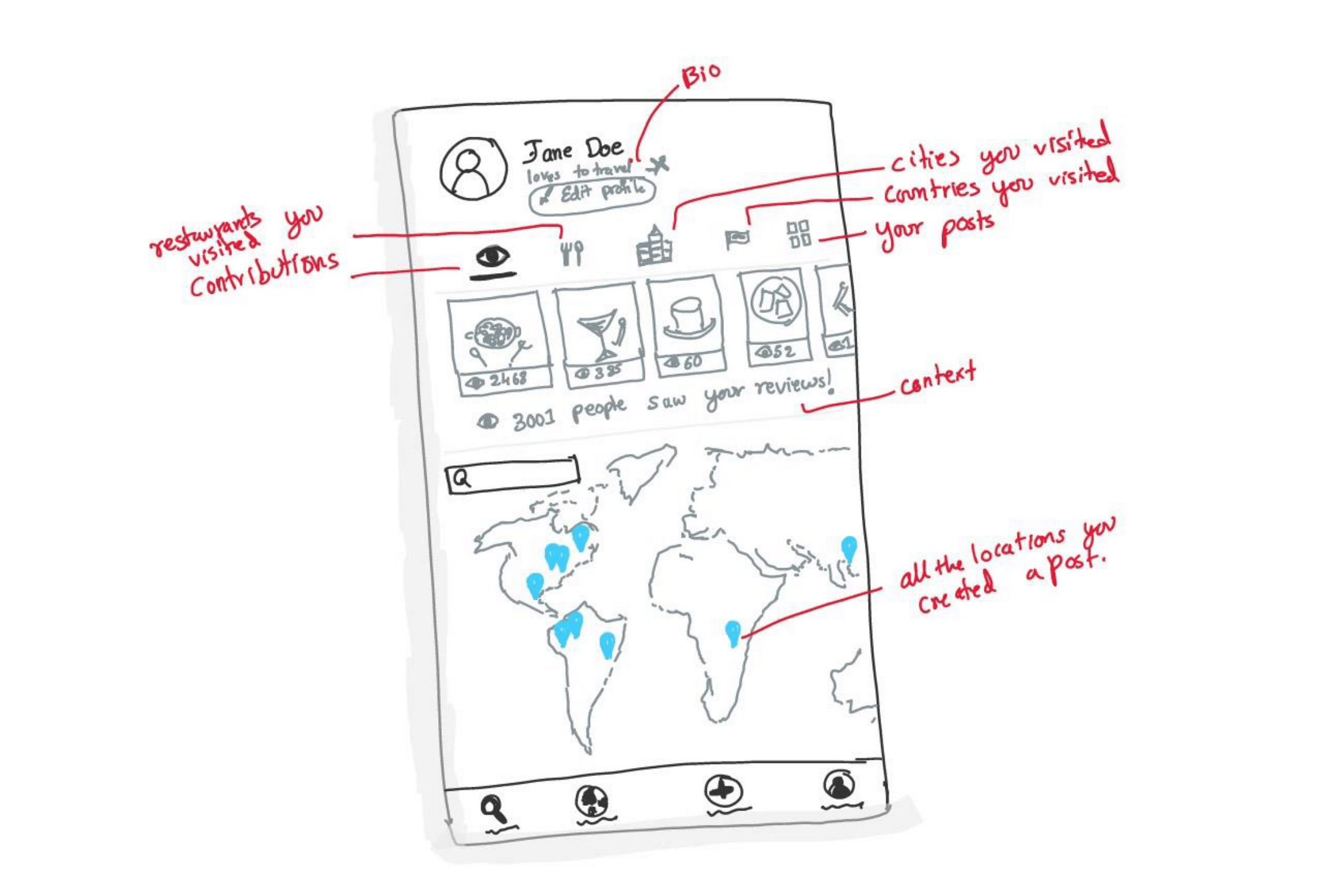
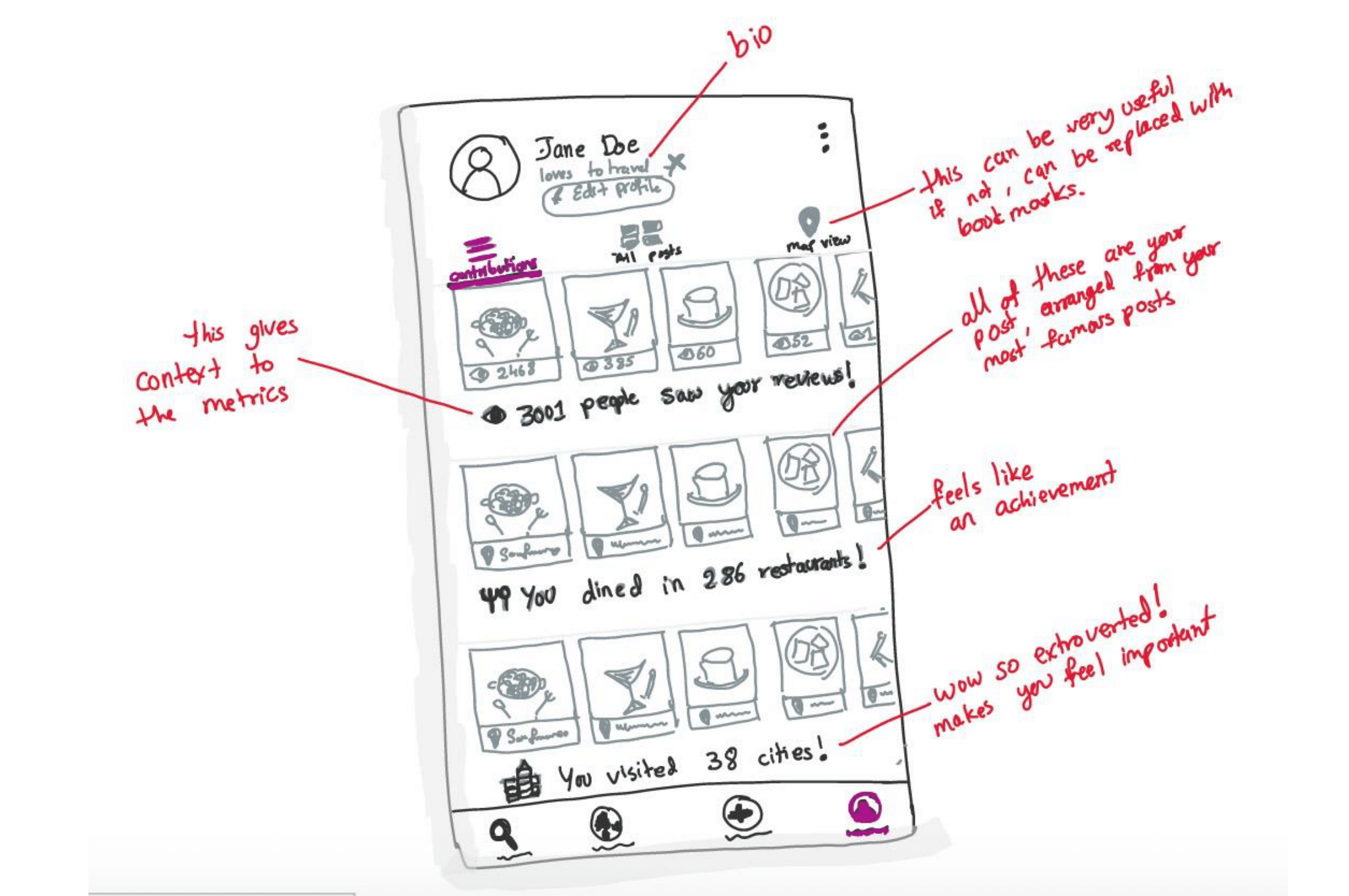
Problem - Design the profile page
Overhaul Atmosfy Profile to align more with other social media apps (Instagram, TikTok, Pinterest). I choose a small sub task to show my process about how I go from brainstorming to Design.
Competative Analysis
Let's look at how the others did it! I started off by doing competative research to design the profile page. There is no point in re-inventing the wheel, so instead of taking the traditional process of design, I decided to do competative research first inorder to deeply understand other social media applications that are thriving right now. I did an analysis of the profile pages of the top ten social media apps of all time. There are some really interesting insights if you'd like to read through them!
TikTok
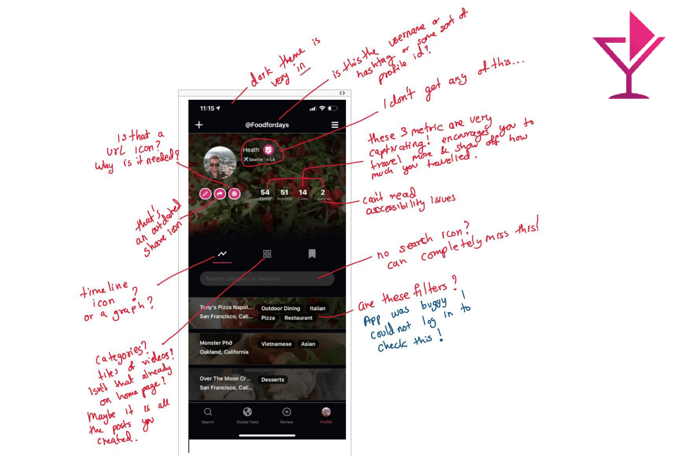
Profile page looks very similar to Instagram. Tik Tok cares a lot more about saved/liked/bookmarked posts. Hence it has a dedicated section in the bottom half and also a call to action in the center middle. I like how they went one more step and gave the ability to make a Profile-Video instead of just a Profile Photo. It’s on brand. Icon for videos you created is odd. Overall it feels like a neat and simple UI. Settings are not hidden like Yelp.
Google Reviews
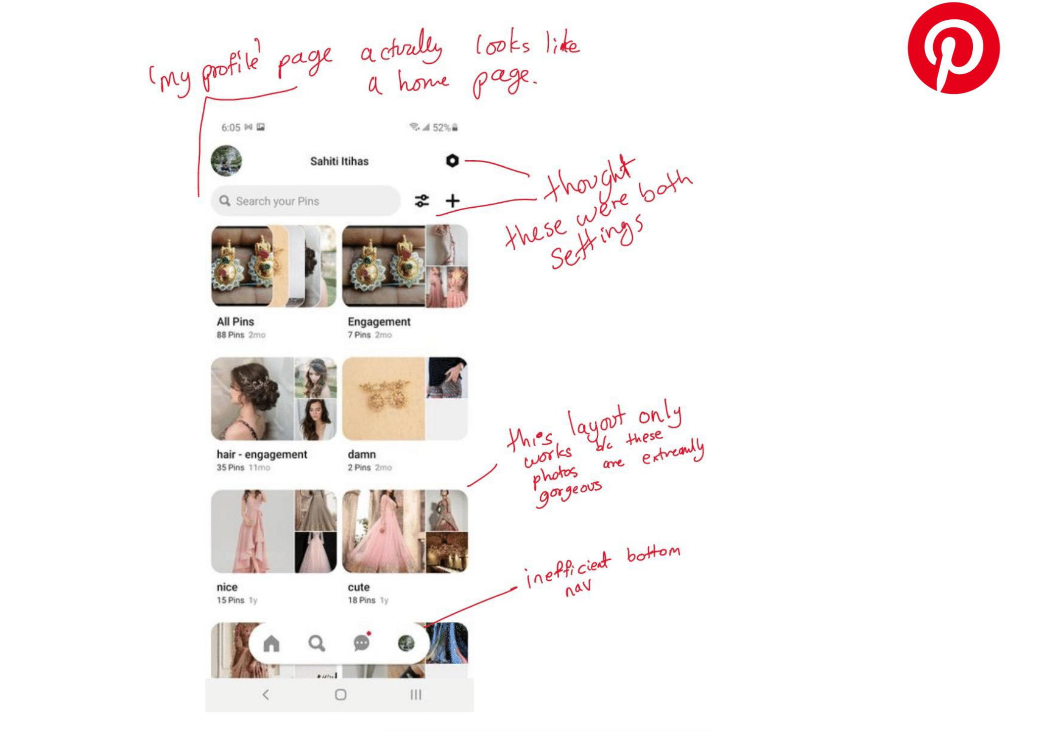
Great job in gamification. It is proved to be a huge success in social apps. Helps give the user a purpose; satisfaction; and helps feed their ego. Unfair advantage: Google is just too massive/popular, hence many of my reviews have 1000s, even tens of thousands of views. Which is breath taking. Showing this number and coupling it with gamification truly encourages the users to contribute more (subconsciously). They took bookmarks one step ahead by creating default categories that give a lot of value for the user: i.e.“want to go” since google maps is integrated in millions of websites, even in other social media apps (Instagram), whenever I find someone post something interesting, I click on it’s maps link and save it under “want to go” – Great features, works so well.
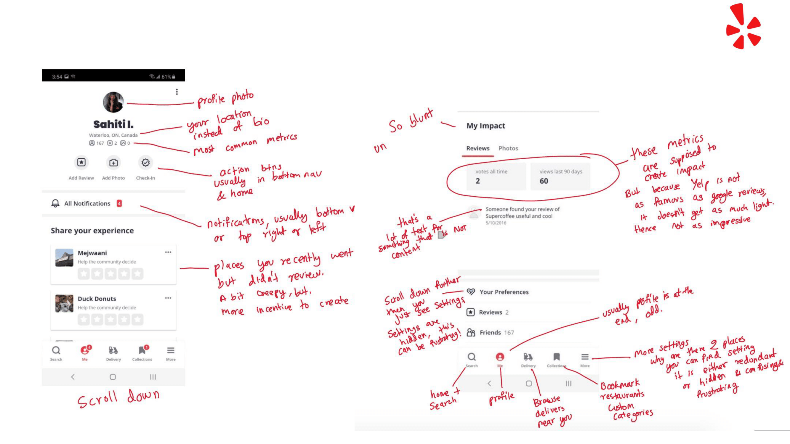
Yelp
Yelp looked the worst of the four I reviewed today, surprisingly. Instead of bio, it shows your location. Odd. This is usually treated like private info and wouldn’t want to showcase it. You are on your profile, you know where you are from, why does that info need to take up prime real-estate of the UI? Weird, important call to action buttons are hidden inside ‘my profile’ It’s a bit creepy that it shows you where you went recently even if you didn’t open yelp. Some settings are hidden under ‘my profile’ tab, you have to scroll all the way down. And there is a second ‘settings’ section from the top right triple-dot menu. This makes it confusing, frustrating, and redundant.
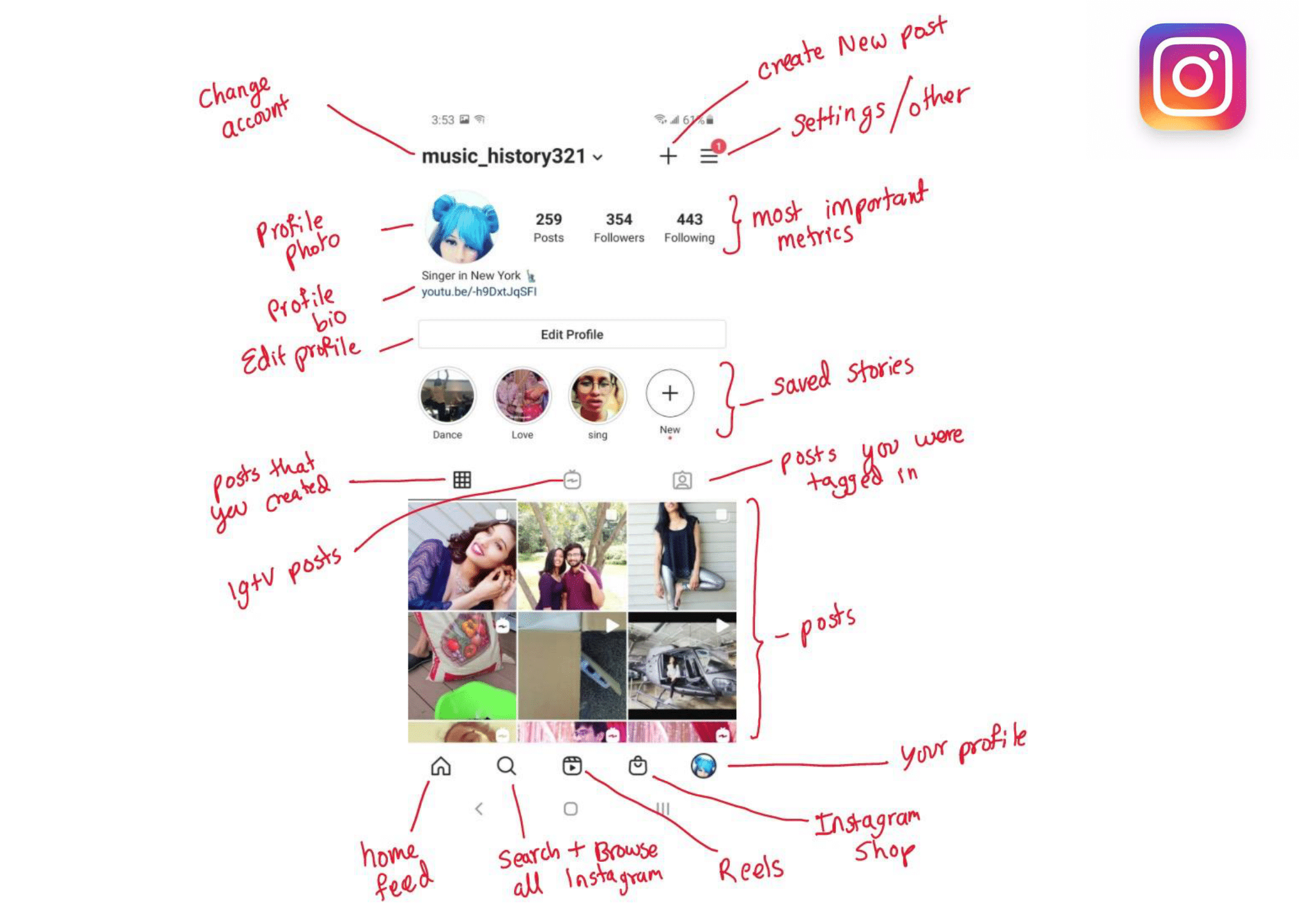
Although Instagram has so many other products within, it still doesn’t feel overwhelming or clustered. Obviously it is very well designed, it’s the golden child of FB. Unlimited money. They integrated big new features/products like ‘shopping’, ‘igtv’, ‘reels’, ’stories’ very seamlessly (which is quite difficult) . Instagram is like 4 products in one, but it feels like one. Because they have so many product, there are many crucial call to action buttons. There is not enough space. As new features come, they have to move older buttons. ‘Likes’ and ‘Messages’ is what keeps bringing you back to the app. But they cleverly hid it in the same place at settings, by adding a red circle-number icon for notifications.
Atmosfy
What do you really need to see on the Profile?
Photo, Name, Bio, Metrics are more meaningful with context, All your posts, Maybe show them on a map, Or a timeline (for more context), Bookmarks, Want to go, Favorites, Encore! (want to go again), Custom Category.
Features that still need to be added
Bookmarks, Search your posts, Filter your posts. This will require a lot of trial and error to figure out the most efficient & intuitive way to include all the features needed. And this process needs to be repeated every time a new feature is introduced. You might even have to move old features around to make space for new ones!