Chefhero
High fidelity mock-ups of web & mobile designs for Chefhero
Microsoft, Chefhero & Atmosfy Portfolio Presentation Slidshow
Product Designer . iOS . Android . Web
I was a lead designer at Chefhero, designing their iOS, Android, and web. Chefhero is a start-up in Toronto which is a B2B platform serving large multinational wholesalers and large chain-food restaurants i.e. Paramount Fine Foods, Strange Love Coffee, Almadina Egyptian Cuisine etc. Previously the orders between wholesalers and restaurants would take weeks, or even months, to process, they still use paper invoices, and manual databases. Chefhero's vision is to make the business between wholesalers and restaurants as easy as a consumer buying something on Amazon.
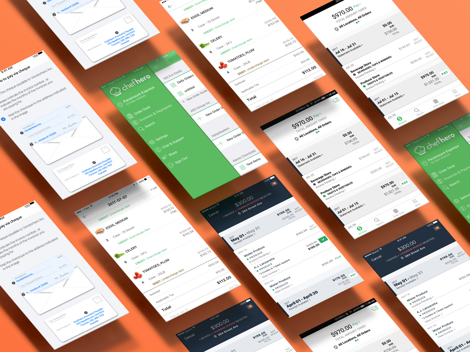
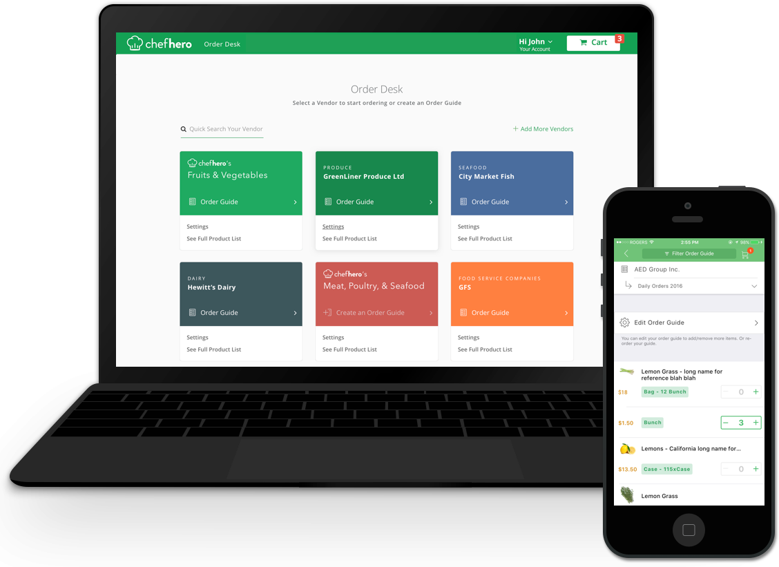
Only five of the hundred screen mockups shown
My Role
I worked on the product's design end-to-end. I would organize a design studio with my team to brainstorm collaboratively. It's a great way to get everyone involved and get new perspectives. Then move on to research, in this phase, based on the user problem at hand, I had coffee dates with several stakeholders (including the internal operations team who is mostly out on the field, the restaurant owners, CEO, CTO, etc.), to pinpoint the roots of the problem. I'd make restaurant personas, user personas, specific use-case storyboards, mood boards if needed. I also used a combination of analytical tools namely: Mixpanel, UXCam & Fullstory, to analyze user behaviour through visual funnels, heatmaps, rage-clicks, user's device info, screen flows, & more.
I would rapidly prototype several parallel low-fidelity ideas and showcase it to the team and even run it through some of our test users & clients. Re-iterate and follow the Material Design & iOS guidelines to make high-fidelity mock-ups. I came to be well versed with the Material Design & the iOS style guides. I have always designed mobile-first. So I would repeat the second half of the above for web. And Voila! That was my everyday routine at Chefhero. I defiantly loved the huge responsibility I was handed at such a successful start-up. I learned a lot by interacting with so many highly qualified & talented individuals on a daily basis!
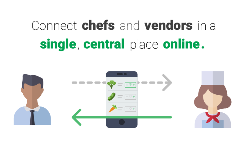
Chefhero is a B2B site like Amazon.com except only for food between vendors and large restaurants.
Chef Experience Journey Map
The very first thing I did when I started was to create user journey maps for the chef experience and the vendor experience. The objective was to learn about the industry and the company. At the same time, this journey map also gave the CEO a high-level perspective to identify inefficiencies and plan what big features to do next. It was also used for determining the company’s direction. I created a vendor journey map to foster a more customer-centric approach to building Chefhero in order to build better relationships with vendors.
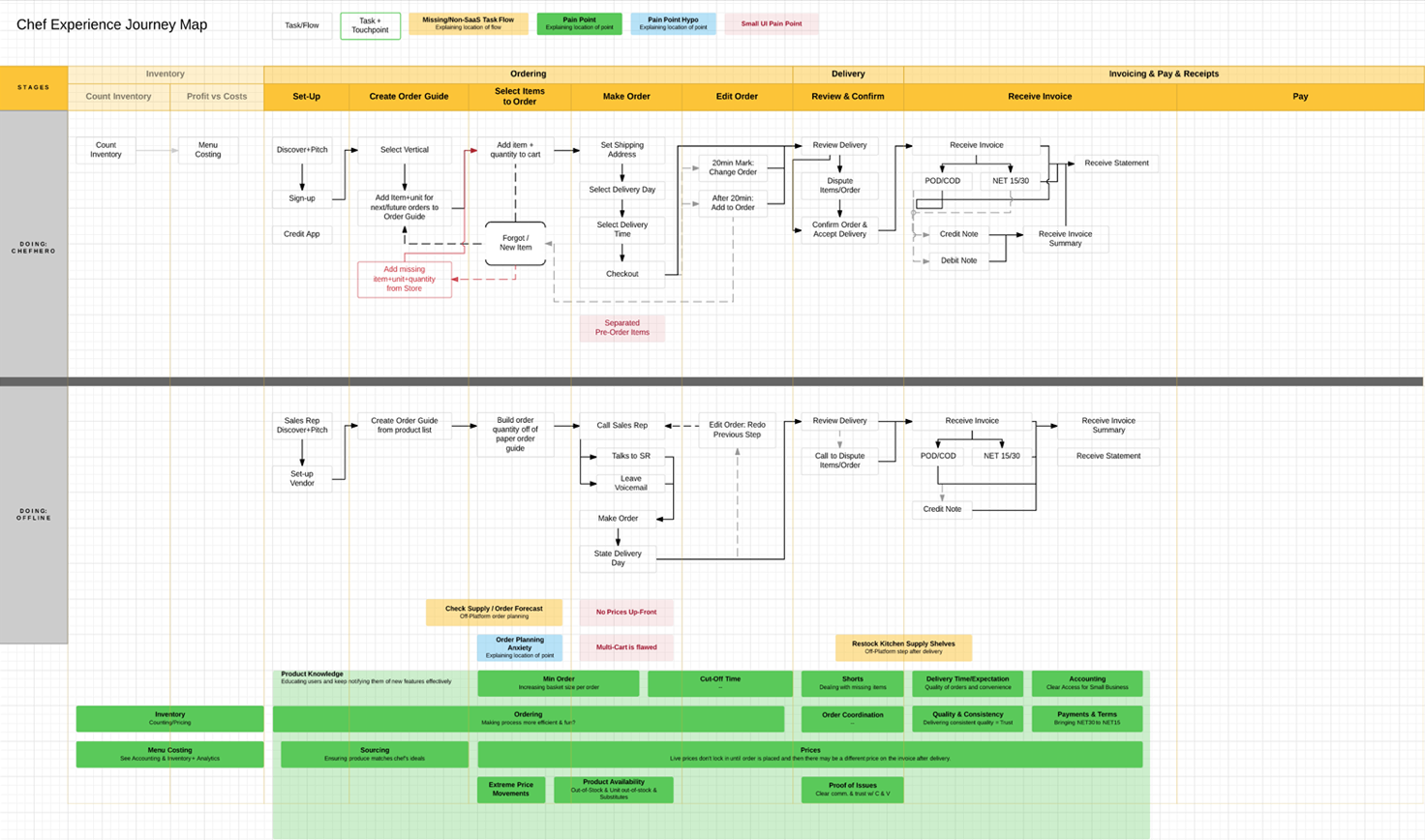
Chef Experience Journey Map

Vendor Experience Journey Map
Interviewing Restaurant Owners
The initial objective was to familiarize myself with Chefhero’s current processes, the apps, & the users, And bonus if I could find inefficiencies to improve.

I got to interview some of the biggest multicultural restaurants in downtown Toronto!
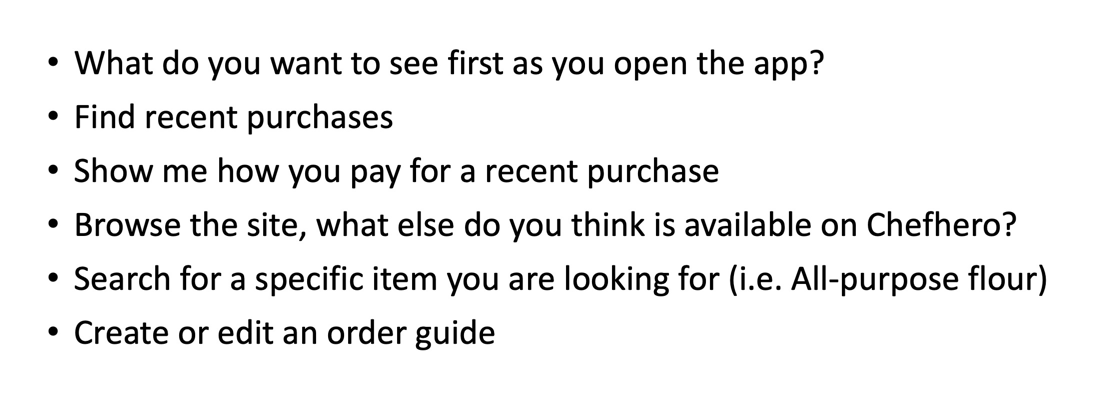
Guerilla Usability Testing
To test the app’s user experience, I surveyed people in our client locations around the GTA and asked them to perform a few predefined tasks in the mobile app as I recorded their actions and took notes. Some of the tasks/questions are in the image above.
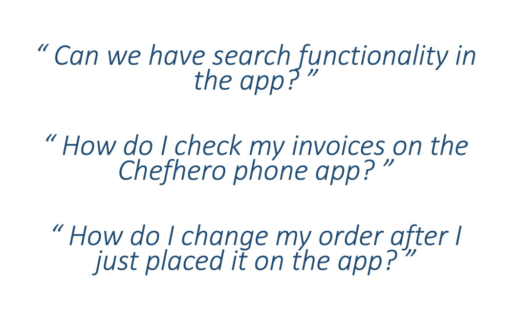
Something really interesting came out of these interviews. It turns out that there are some fundamental problems with the Chefhero mobile application. When I dug further, it turned out that the mobile app was originally developed in the company hackathon and was never really designed. To confirm my hypothesis, I used more research tools to conduct my analysis.
Chef Environment
Another observation I made was that the chef environment when I went to their restaurant was quite busy. No space for a laptop or a desktop. Only the manager would use the computer in the back office once in a while. There is a lot more opportunity for the mobile app to be used in this environment than a web application. For Chefhero to be used more often, we need to emphasize the mobile application more. Toronto is also a very multicultural city with amazing food from all over the world. So we also need to keep in mind that our users are mostly not native English speakers, and they might not be highly technically inclined. Therefore when redesigning the mobile app, I made sure to use conventions that are most intuitive. For instance, I got rid of the hamburger menu and added a botton navigation. And re-designed the entire mobile app-navigation.
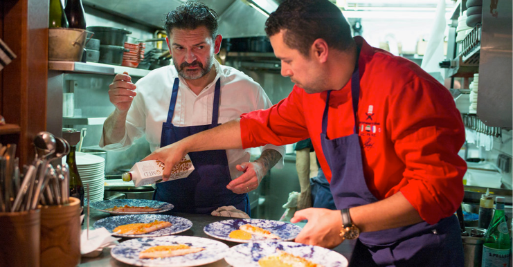
This is the type of chef environment that is apparent in the restaurants I hve interviewed.
Affinity Map
I used an affinity map to group my interview findings into sections of the mobile app.
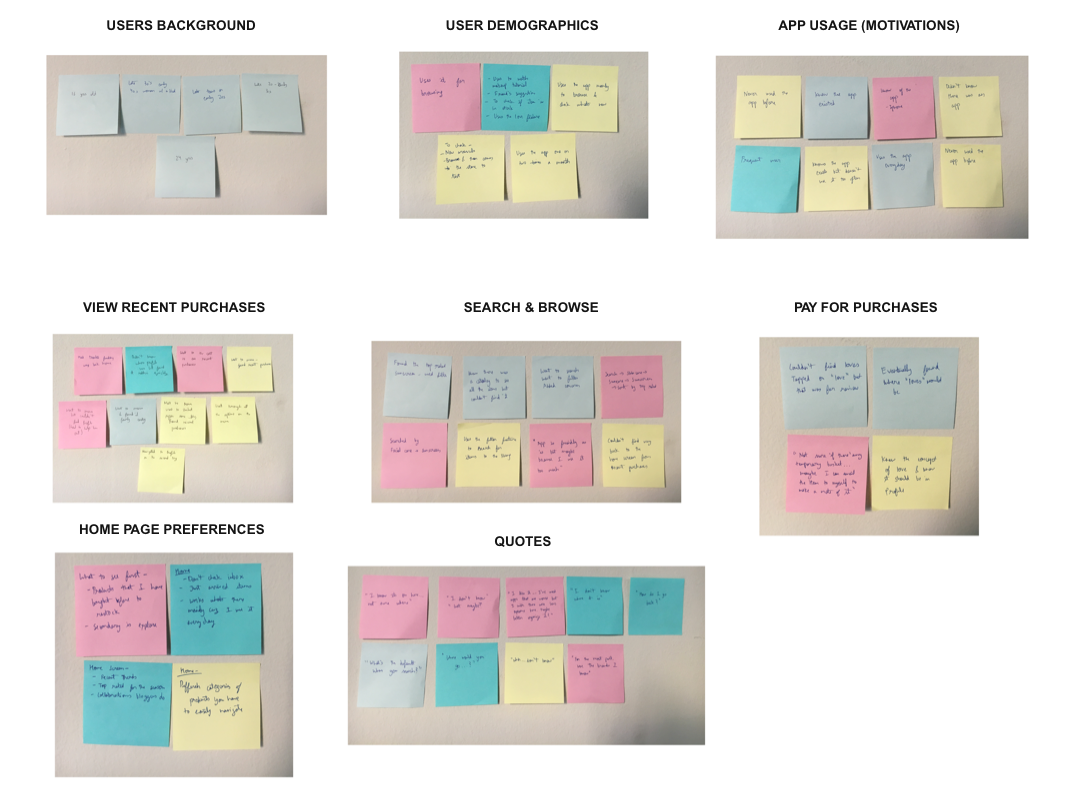
I used an affinity map to group my interview findings into sections of the mobile app.
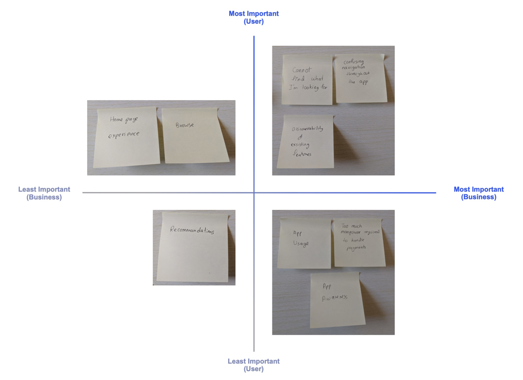
2x2 Matrix Analysis
Another tool I utilized was 2x2 matrices. They help designers better understand the relationships between two things on a spectrum. I used it in my research findings to map issues important to Chefhero’s customers versus Chefhero’s business. It also helped me prioritize which issues to tackle first.
I used an affinity map to group my interview findings into sections of the mobile app.
IDENTIFYING THE PROBLEM
The following three issues stood out the most. Also, that one user who was able to navigate without frustration was the owner's son who is young and good with technology. What is really interesting is that our main feature: Search was hard to find not only for the users I interviewed but also some of our sales representatives in the company!
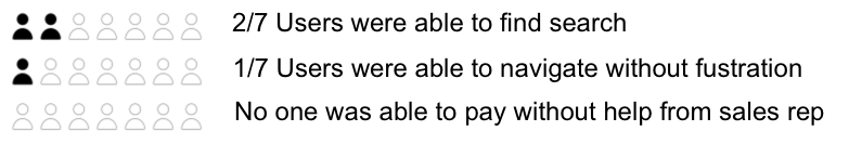
The following three issues stood out the most.
Old INFORMATION ARCHITECTURE
Most users were having trouble navigating through the current app. Therefore, in order to redesign the app, I built the information architecture to understand its structure and pin-point the inefficiencies.
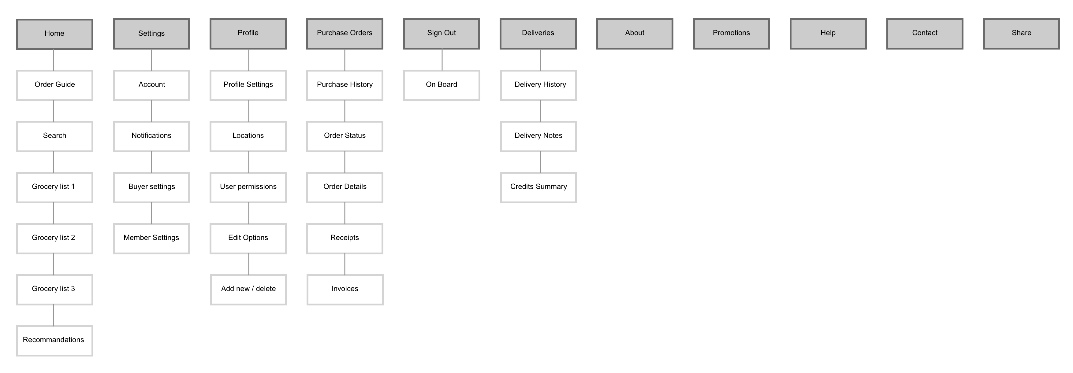
The old structure of the mobile application.
New REVISED INFORMATION ARCHITECTURE
The newly designed IA increases the visibility of the app’s key features and improves the overall organization and navigation throughout the app.
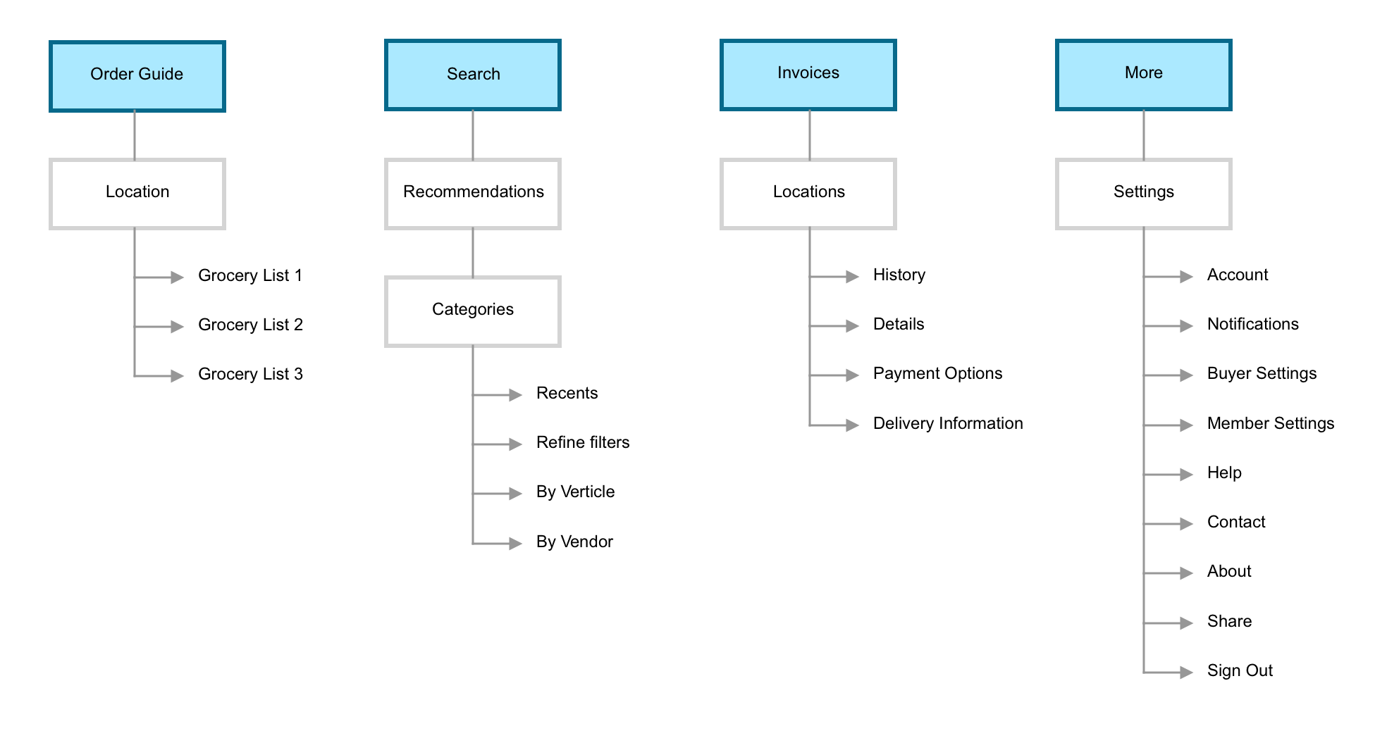
I designed a new information architecture for the mobile app.
My Throne